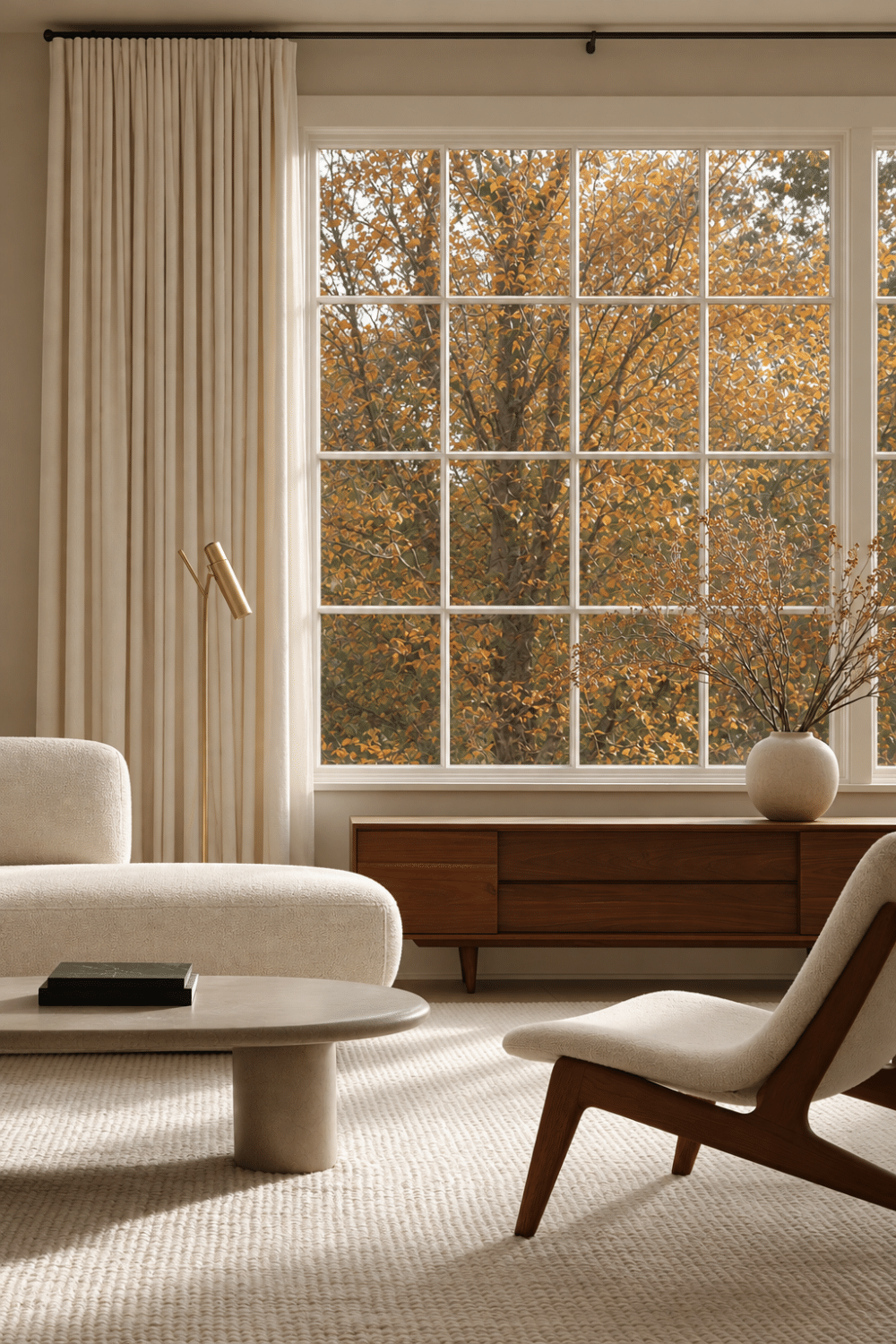
Why Some Neutral Rooms Feel Flat
Have you ever saved a beautifully serene room, fallen in love with every soft shade of cream and beige, then wondered why those same colors do not feel quite as special in your own home? You may have carefully chosen the furniture, added the rug, styled the shelves, and still feel as though something is missing. That is one of the frustrating things about neutral room decor: a room can contain beautiful pieces and still somehow feel flat.
When that happens, the instinct is often to add something. Another pillow. A patterned throw. A new accessory. Maybe even a color you were never completely sure you wanted. But before changing the palette, it helps to look at how the elements already in the room relate to one another.
Designers rarely make every surface, shape, and finish feel the same. They create subtle contrast between light and dark, soft and hard, smooth and tactile, curved and structured. Those differences give the eye something to notice while allowing the overall room to remain calm and cohesive.
Ahead, we will look at five ways designers use contrast to make a neutral room feel richer without completely redecorating or introducing dramatic color. Because if you already love your palette, you may not need to change it at all. You may simply need to give it a little more dimension.
Create a Light, Midtone, and Dark Layer
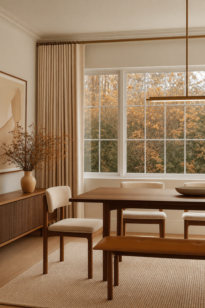
A neutral room can be filled with beautiful pieces and still feel a little washed out when everything sits at the same level of lightness. Designers usually avoid that by creating contrast between lighter, medium, and deeper tones, which gives the eye somewhere to travel and helps the room feel more grounded.
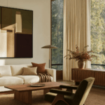
Neutral room decor often begins to feel richer once there is enough difference between the lightest and deepest elements in the space. Ivory or cream can create the light layer, camel or taupe can bring in a softer midtone, and walnut, espresso, or bronze can anchor the room without making it feel heavy. The deeper notes do not need to dominate. Repeating them in just a few places can make the entire palette feel more intentional.
A simple formula to try is: Light + Midtone + Dark.
- Use ivory, cream, or warm white for the lightest layer.
- Bring in camel, mushroom, taupe, or natural oak as the midtone.
- Add walnut, espresso, bronze, or another deeper neutral for contrast.
- Repeat the darkest tone in two or three places for cohesion.
- Let lighter textiles and surfaces keep the room feeling open.
- Avoid making every major piece the same beige or cream value.
This kind of tonal contrast creates visual depth while preserving the peaceful quality that makes a neutral color palette so appealing. The room still feels calm, but it no longer feels flat.
Styling Note: Take a quick black-and-white photo of the room. If everything blends into nearly the same shade, you may need one deeper or lighter element to create more dimension.
Contrast Soft Textures With Hard Surfaces
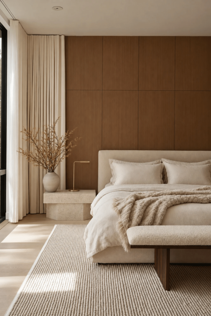
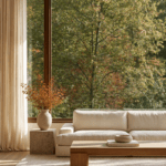
A neutral room can still feel flat even when the colors are beautiful if every surface behaves the same way. Texture is what gives a restrained palette something to hold onto. Soft boucle against walnut, linen beside stone, or wool layered over hardwood creates the kind of contrast you can almost feel before you touch it.
The strongest textured interiors balance softness with structure. Rougher natural materials create shadow and variation, while upholstered pieces and textiles keep harder surfaces from feeling severe. Too many smooth finishes can make a room feel sterile, while too many plush materials can make it feel visually heavy. The richness comes from letting both exist together.
To create more tactile contrast in a neutral room:
- Add a substantial wool rug beneath smoother furniture.
- Pair a wood table with upholstered seating.
- Place handmade pottery on a polished surface.
- Introduce linen where the room has a lot of glass or stone.
- Mix one visibly rough texture with softer textiles.
Texture makes warm neutral decor feel more inviting because the room becomes something you want to experience, not just admire. A beautiful palette may catch your eye, but tactile contrast is often what makes you want to stay.
Styling Note: If a neutral room looks beautiful in a photo but feels flat in person, look at the surfaces. You may need a different texture, not another color.
Mix Materials Instead of Matching Everything
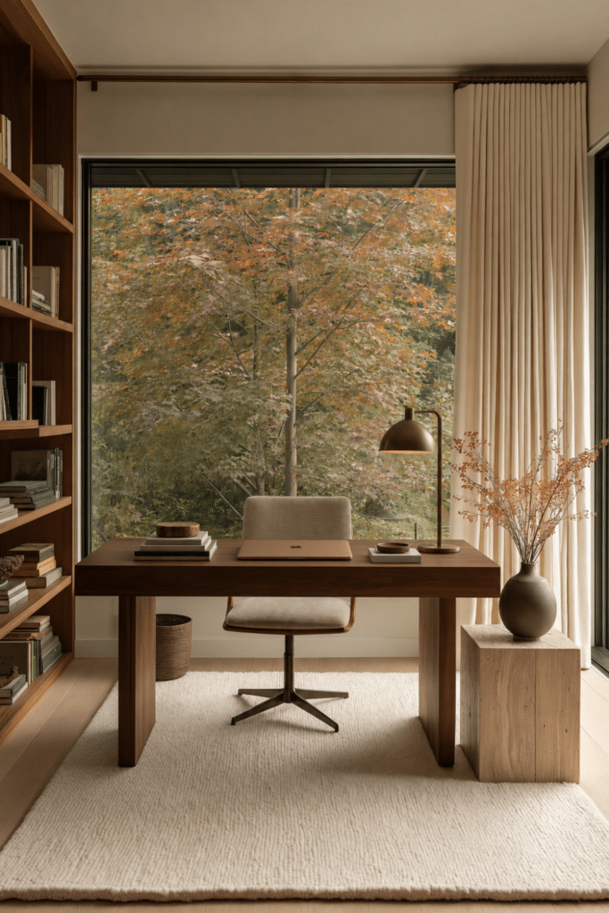
A neutral room can feel beautifully coordinated and still lack personality when every finish is trying too hard to match. Designers often create more interest by mixing materials that share a similar warmth without being identical. That subtle variation is what makes a room feel collected over time instead of furnished all at once.
The most sophisticated neutral room decor usually feels collected rather than perfectly matched. Walnut can sit beside oak when the undertones relate. Stone adds movement and irregularity. Brass or aged bronze introduces a quiet reflective note, while handmade ceramics keep polished surfaces from feeling too manufactured. The palette can stay restrained because the materials themselves are creating the contrast.
A simple place to start is: Wood + Textile + Something Mineral or Metallic.
- Pair walnut with linen and natural stone.
- Combine oak with wool and aged brass.
- Mix woods that share warm undertones instead of matching them exactly.
- Use handmade ceramics to soften sleek or highly finished furniture.
- Add one metal finish for subtle contrast and a hint of reflection.
- Repeat materials sparingly so the room still feels cohesive.
Mixed materials give a layered interior character without making it feel busy. The room begins to show evidence of nature, craftsmanship, and time, which is often what separates a warm, personal home from one that feels a little too showroom-perfect.
Styling Note: When adding something new, do not ask, Does this match? Ask, Does this relate while bringing something different? That small shift can make a neutral room feel far more considered.
Balance Curves With Stronger Lines
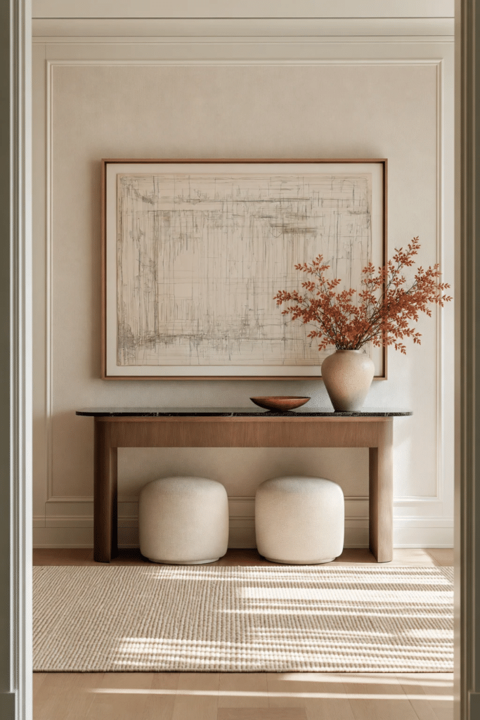
A neutral room can feel beautifully calm and still come across as a little stiff when every piece follows the same shape. Too many straight edges can make a space feel rigid, while too many rounded forms can leave it without enough structure. Designers often create movement by balancing the two.
Shape contrast is one of the quieter forms of contrast in interior design, but it can change the entire rhythm of a room. A curved sofa can soften built-in cabinetry, a round coffee table can break up a series of rectangular pieces, and sculptural lighting can add interest above low horizontal furniture. The goal is not to make every shape different. It is to create enough variation that the eye keeps moving naturally.
To introduce more shape contrast:
- Pair a curved sofa or chair with straighter architectural lines.
- Use a round or oval coffee table among rectangular furniture.
- Add sculptural lighting above a low, linear console or dining table.
- Introduce organic shapes through artwork or decorative vessels.
- Leave some negative space around sculptural pieces so their silhouette can stand out.
This kind of visual balance gives a layered interior energy without making it feel busy. The room still feels calm, but it also feels more intentional and designed rather than simply furnished.
Styling Note: Stand at the doorway and look only at the outlines of your furniture. If everything is rectangular, one curved element may be enough to change the entire rhythm of the room.
Give One Element More Visual Weight
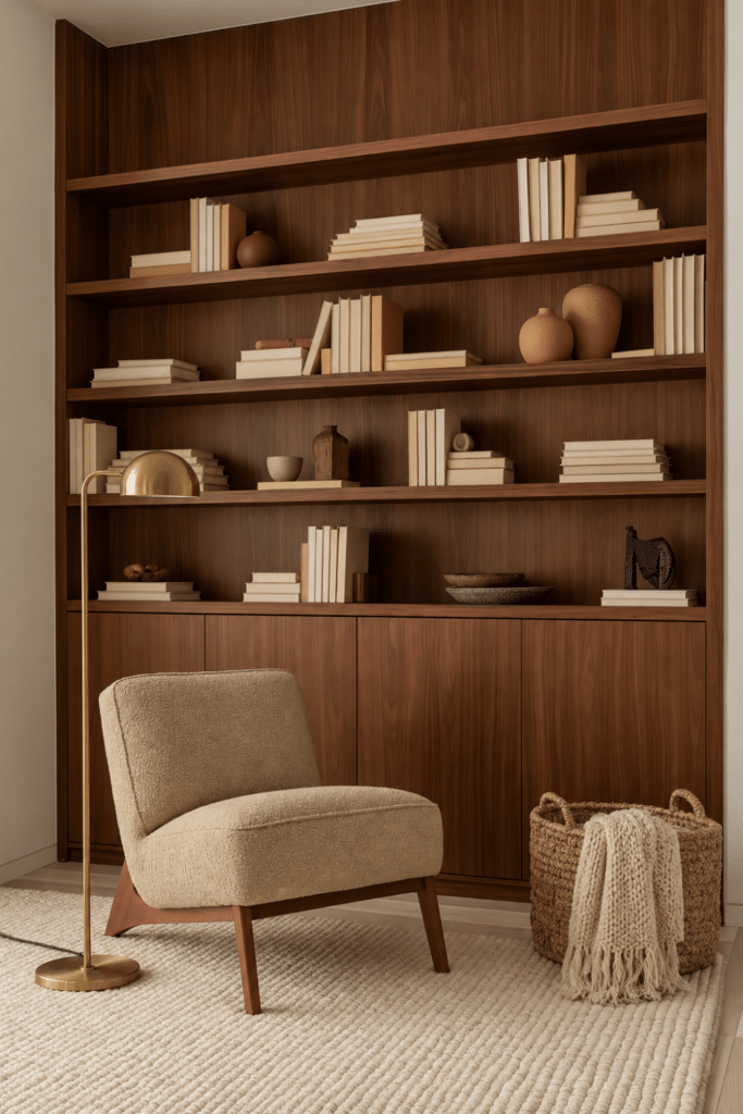
A neutral room can feel beautifully calm and still lack direction when every piece is trying to be equally quiet. Designers often solve that by allowing one element to carry more visual weight, giving the eye somewhere natural to land while the rest of the room plays a supporting role.
Neutral room decor becomes much more compelling when one element is allowed to lead and the rest of the room supports it. That focal point might be a dark walnut cabinet, oversized artwork, a stone fireplace, a sculptural light, or one deeper upholstered chair. The contrast does not have to be dramatic. It simply needs to be strong enough to create visual hierarchy and give the space a clear sense of intention.
Try the formula: Quiet foundation + one stronger moment.
- Let one substantial piece become the visual anchor.
- Keep nearby accessories quieter so they do not compete.
- Repeat a darker accent once or twice elsewhere for balance.
- Use scale, material, or shape to create emphasis without adding more color.
- Leave some negative space around the focal point so it can stand out.
- Avoid giving every corner an equally strong decorative moment.
A strong focal point actually allows the rest of the room to relax. Instead of feeling pressure to decorate every surface, you can let one beautiful feature tell the story and give the surrounding space room to breathe.
Styling Note: Ask yourself, What should I notice first when I enter this room? If the answer is everything, or nothing, the room may need a stronger visual anchor.
Neutral Does Not Have to Mean Subtle Everywhere
A neutral room does not need more color to feel interesting. Sometimes, it simply needs more contrast. A deeper tone beside something light, softness against a harder surface, mixed materials, a curved shape among straighter lines, or one element with enough presence to lead can completely change how the room feels.
You do not need to use all five ideas at once. Start with what your room seems to be missing. Bring in one darker wood piece, introduce a different texture, add a material that contrasts with what you already have, soften the geometry with one curved object, or allow a favorite piece to become the focal point.
The best neutral room decor does not rely on color alone for interest. It uses contrast to create depth while preserving the calm that makes a neutral home so inviting.
A neutral room should feel quiet, but it should never feel empty of personality. The goal is not to make the room louder. It is to give the eye enough variation to keep discovering something beautiful.
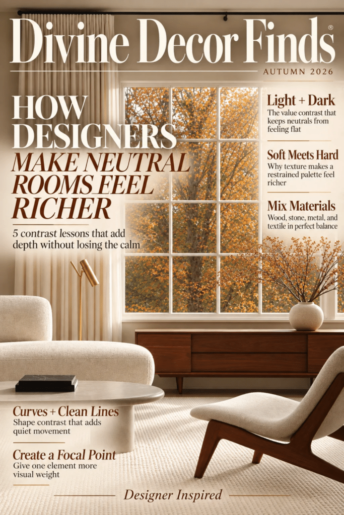
Save this post to Pinterest for the next time your neutral room feels beautiful, but a little too flat.
Explore more Designer-Inspired ideas on Divine Decor Finds for thoughtful ways to create a home that feels layered, elevated, and beautifully yours. 🌿
Leave a Reply