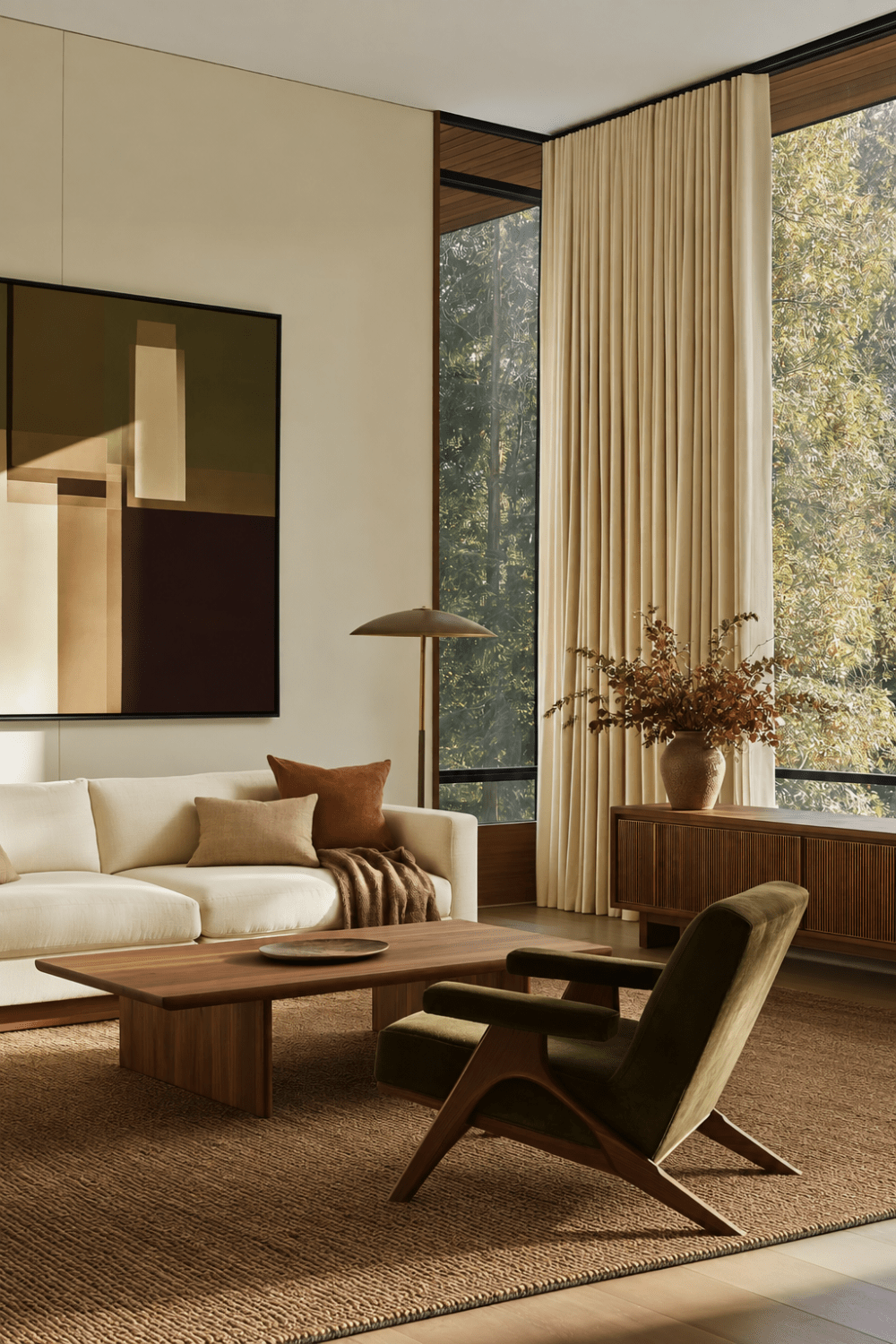
Why Olive Green Feels Right for Fall
There is a moment each year when summer begins to soften and home starts asking for something deeper. The light feels warmer, evenings arrive a little earlier, and the pale, airy layers that felt perfect in July suddenly seem to need more grounding. That is where olive green home decor feels especially beautiful. It brings richness into a room without making it feel dark, and it has a quiet connection to nature that makes the transition into fall feel almost effortless.
What makes olive green so interesting is that it lives somewhere between a neutral and a statement color. It has enough depth to change the mood of a room, yet when it is used thoughtfully, it can feel calm, familiar, and surprisingly easy to live with long after autumn has passed.
The secret is not simply adding more green. The shade you choose, the materials surrounding it, and the amount of visual space you give it can completely change how the color feels. One olive can look warm and sophisticated, while another can feel heavy or flat in the very same room.
And you do not need to repaint your walls or commit to a new sofa to experience that shift. Sometimes one beautifully chosen piece is enough to change the balance of a space. Before deciding where to add olive, it helps to understand why certain shades, textures, and combinations make this earthy color feel so effortlessly rich.
Choose the Olive That Works With Your Light
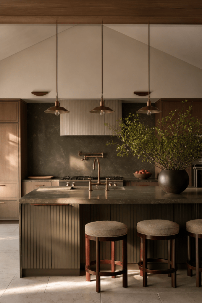
Olive green can be surprisingly changeable. In one room, it may feel warm, earthy, and almost golden. In another, the exact same shade can read cooler, grayer, or much deeper than expected. That is because olive is not one fixed color. Its undertones can lean yellow, brown, gray, mossy, or slightly khaki, and the light in your home will bring those differences forward.
A bright, sunlit room often makes olive feel warmer and more luminous, while softer or cooler light can emphasize its muted side. This is why decorating with olive green starts with more than choosing a shade you love on a screen or paint card. You need to see how that color behaves in the room where it will actually live.
Before committing to an olive shade:
- Test it in both morning and afternoon light.
- Hold the sample beside your flooring, wood tones, and existing upholstery.
- Notice whether the color becomes too yellow, too gray, or too dark as the light changes.
- Use a larger paint or fabric sample whenever possible.
- Look at the shade again in the evening under your usual lamps.
- Give yourself a day or two before deciding.
For warm Organic Modern spaces, muted brown-based olives and softly mossy greens tend to feel especially natural. They sit comfortably beside warm wood, creamy textiles, and tactile finishes without making the room feel overly saturated.
The right olive green color palette should feel as though it belongs in the room already. It should settle into the materials around it rather than compete with them.
Styling Note: Never choose olive in isolation. Place the sample beside the actual wood, flooring, rug, or fabric it will live with. The surrounding materials will tell you more about the color than the swatch ever can.
Build the Palette Around Warm Contrast
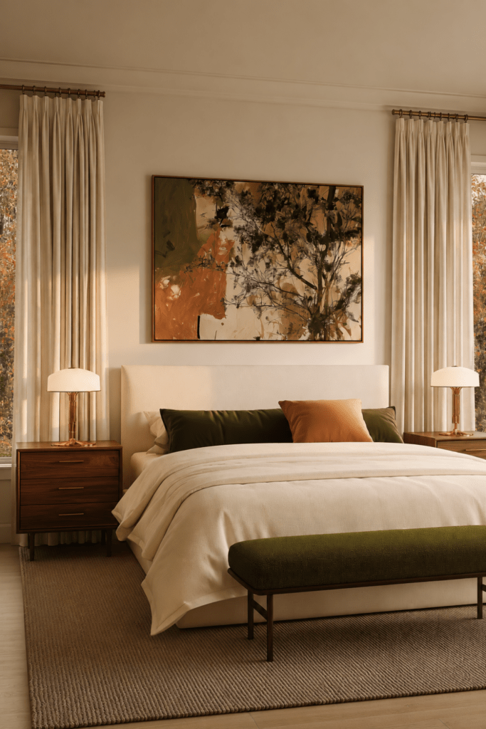
Olive green has natural depth, which is part of what makes it so beautiful. But when too many similarly deep or cool tones surround it, the room can begin to feel heavier than intended. The easiest way to keep olive feeling refined is to give it contrast through lighter neutrals, warm wood, and subtle metallic finishes.
Think of the palette as a balance of light and depth. Cream softens olive. White oak keeps it relaxed. Walnut makes it feel richer. Camel introduces warmth without competing for attention, while aged brass can bring out the color’s quieter golden undertones.
Some of the most flattering colors that go with olive green include:
- Warm ivory: brightens the palette without creating harsh contrast.
- Oatmeal: adds softness and keeps the room feeling natural.
- Creamy beige: creates warmth while allowing olive to remain the focal point.
- Soft taupe: gives the palette depth without making it feel too dark.
- Camel: brings in an earthy warmth that feels especially beautiful in fall.
- White oak: keeps olive green and wood tones light, relaxed, and contemporary.
- Walnut: adds richness and makes muted olive feel more sophisticated.
- Aged brass: introduces gentle warmth and highlights olive’s golden undertones.
- Warm clay: adds an earthy accent without pushing the room into obvious seasonal decorating.
If warmth is the goal, be careful with large amounts of stark white or cool gray. Those pairings can make olive appear flatter, colder, or more severe, particularly in rooms without abundant natural light.
This is where olive green home decor can feel especially layered. Rather than surrounding the color with more competing shades, let warm materials do some of the work. A creamy sofa, walnut table, olive chair, and aged brass lamp can create far more dimension than adding several additional colors.
Styling Note: Build your palette with three anchors first: one light neutral, one wood tone, and one warm metal. Once those feel balanced with the olive, decide whether the room truly needs another color.
Use Texture to Change the Mood of Olive
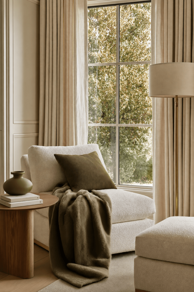
Olive green is one of those colors that can change personality depending on what carries it. In linen, it can feel relaxed and earthy. In velvet, it becomes richer and more dramatic. In wool, it feels grounded and cozy. The color may stay nearly the same, but the texture changes the entire mood.
That is why olive green textiles are such an easy way to add depth without making a room feel too coordinated. Instead of repeating the same fabric throughout the space, mix materials that catch the light differently and invite touch in different ways.
Think about how olive feels in each material:
- Linen: relaxed, breathable, and natural.
- Velvet: deeper, richer, and more luxurious.
- Wool: warm, substantial, and grounding.
- Washed cotton: soft, casual, and easy to live with.
- Ceramic: sculptural, quiet, and restrained.
- Boucle: tactile, contemporary, and visually soft.
Layering these textures creates dimension, especially in an earthy green decor palette where the colors themselves may be muted. An olive velvet pillow beside an oatmeal linen sofa feels very different from an olive ceramic vessel on a walnut console, even though both bring the same color family into the room.
For Organic Modern olive green, texture is often what keeps the palette from feeling flat. Natural fibers, matte ceramics, brushed metals, and warm wood give the color enough variation to feel collected rather than matched.
Styling Note: If you want olive to feel richer without making the room visually heavier, use the most luxurious texture on the smallest element. A velvet pillow, wool throw blanket, or handcrafted ceramic piece can add depth without overwhelming the space.
Decide How Much Visual Weight You Want
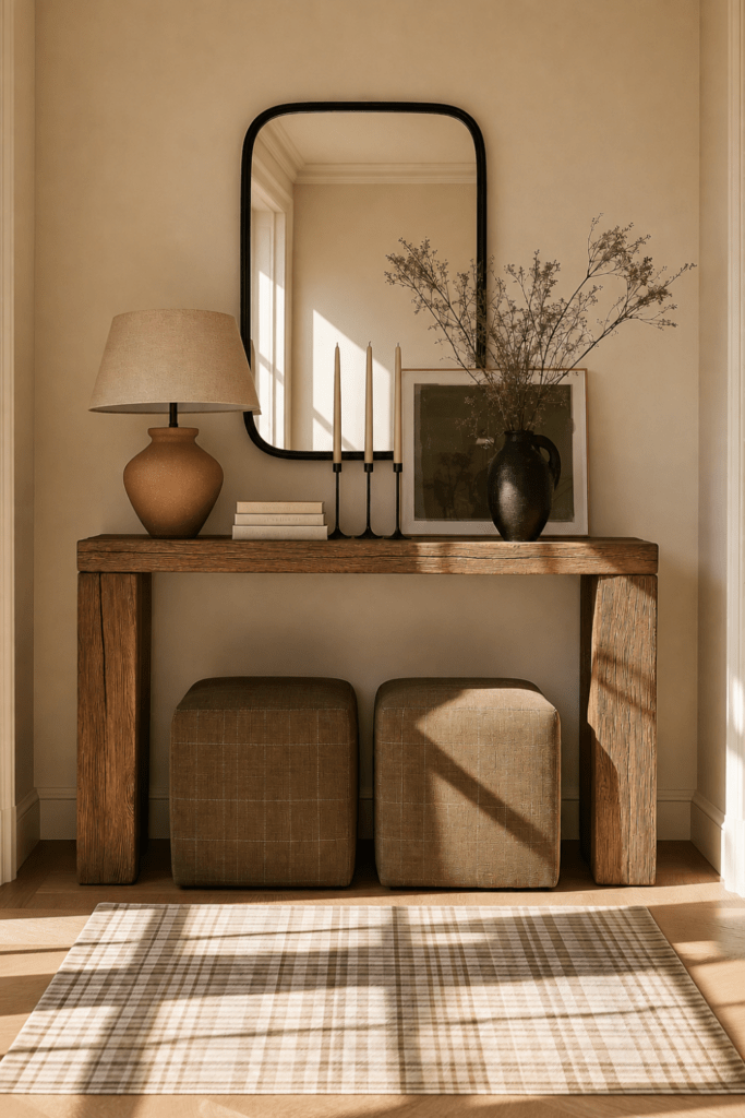
Olive green can whisper or completely shape a room, depending on how much space it occupies. A ceramic vase introduces the color quietly. An upholstered chair gives it more presence. Painted cabinetry or a full wall makes olive part of the room’s architecture. The shade may be the same, but the visual weight changes dramatically with scale.
Thinking about color this way makes olive green home decor much easier to use. Instead of asking whether you should “add more green,” decide how much presence you actually want the color to have.
Choose the level that feels right for your space:
Low commitment
- Accent pillows
- Pottery
- Artwork
- Table linens
- Small decorative objects
Medium commitment
- An upholstered chair
- Bedding
- Curtains
- A bench
- An area rug
High commitment
- Painted cabinetry
- Full walls
- A sofa
- A large upholstered headboard
- Built-ins
The larger the olive element, the more breathing room it needs. If an olive sofa or painted cabinet is already carrying the room visually, surrounding it with several additional green pieces can dilute the impact. Instead, let one substantial element lead and repeat the color once or twice in smaller, quieter ways.
That restraint is often what makes olive green accents feel sophisticated. One beautifully chosen chair paired with a smaller olive detail in artwork or pottery creates rhythm without making the room feel overly coordinated.
And there is no “correct” amount of color. If you love olive but prefer a lighter room, a few small touches may be enough. If you want something moodier and more immersive, a larger commitment can be beautiful when the rest of the palette gives it space to breathe.
Styling Note: Before adding another olive element, step back and look at the room as a whole. Ask whether the color needs another echo, or whether the first olive moment is already doing exactly enough.
Make Olive Feel Like Fall Without Making It Seasonal
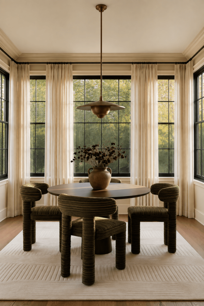
Olive already carries some of fall’s richness on its own. It feels earthy, muted, and naturally connected to the changing landscape, which means you do not need pumpkins, themed signs, or obvious seasonal accessories to make the room feel appropriate for autumn.
Instead, deepen the palette with one or two warmer tones and richer materials. Burgundy adds contrast. Rust brings warmth. Muted clay softens the transition. Dark walnut gives the room more depth, while aged brass introduces a subtle glow. Heavier linen and warm wool can shift the atmosphere just as effectively as color.
Try combinations like:
- Olive chair + burgundy accent pillow + walnut side table
- Olive bedding + ivory linen + aged brass lamp
- Olive cabinetry + warm stone + walnut accents
- Olive pottery + rust florals + creamy walls
- Olive textiles + soft plum artwork + warm wood
- Olive upholstery + muted clay accents + brass details
The key is restraint. An earthy fall color palette feels more sophisticated when one deeper autumn tone is allowed to support the olive rather than compete with it.
This is also why olive green and burgundy work so well together. Olive provides the grounding base, while burgundy adds a richer note without pushing the room into obvious seasonal territory. Rust, clay, and soft plum can create the same effect when used sparingly.
A room should feel like fall because it has become warmer, richer, and more layered, not because it looks decorated for a holiday. Let texture, natural materials, and deeper color relationships do the seasonal work.
Styling Note: Choose one deeper autumn tone to accompany olive and repeat it once nearby. That small echo will usually feel more intentional than adding several fall colors at once.
Let Olive Add Depth, Not Drama
Olive green does not need to dominate a room to change the way it feels. Sometimes its greatest strength is the quiet depth it adds, especially when the shade is chosen carefully and surrounded by materials that bring out its warmth.
Start with the olive that works with your light. Balance it with creamy neutrals, natural wood, and aged brass. Let texture shape whether the color feels relaxed, cozy, or refined. Then decide how much visual weight you want it to carry, from a single accent to a larger statement like cabinetry, upholstery, or walls.
For fall, there is no need to layer olive with every seasonal color at once. A touch of burgundy, rust, warm clay, or deeper wood is often enough to make the palette feel richer and more connected to the season.
The beauty of olive green home decor is that it can feel autumnal without feeling temporary. Used with restraint, it creates warmth and dimension that can remain long after the leaves outside have changed.
Begin with the level of commitment that feels comfortable, then let the rest of the room support it. The most inviting spaces are not the ones using the most color. They are the ones where every color feels like it belongs.
Save this post to Pinterest for olive green styling inspiration you can return to all season. 🤎
Explore more Organic Modern color and seasonal styling ideas on Divine Decor Finds. 🌿