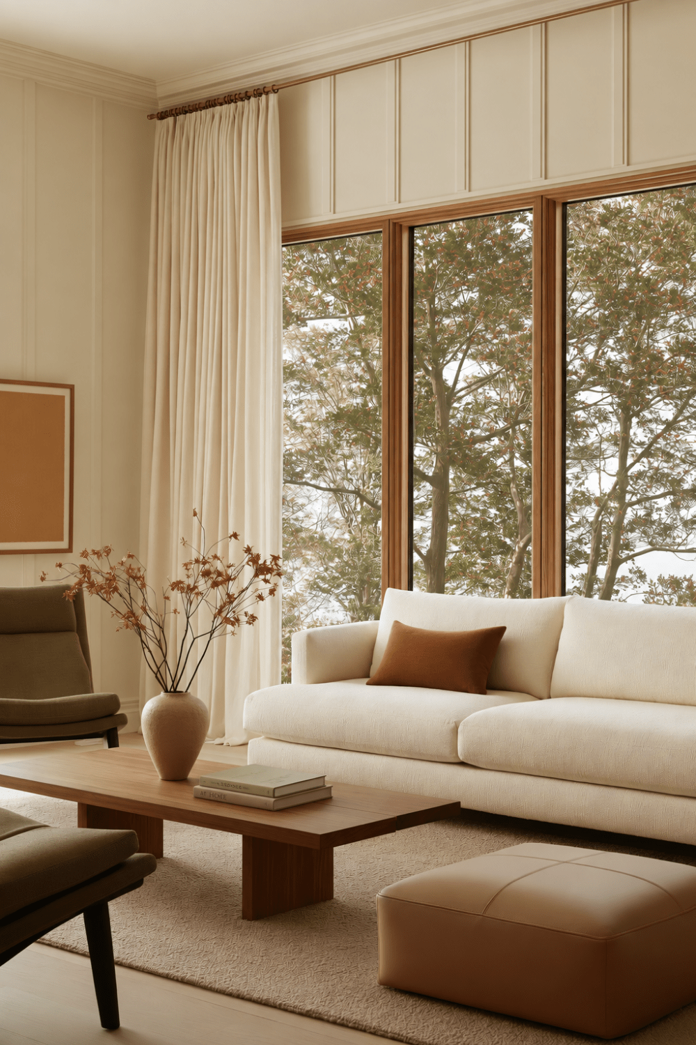
Fall Color Without the Rustic Clichés
The moment the light begins to soften and the days feel a little slower, it is natural to want home to feel different too. But embracing earthy fall colors does not have to mean surrounding yourself with dark rooms, obvious seasonal decor, or a style that suddenly feels more rustic than the home you love.
The difference often comes down to what you place beside a richer shade. Give it something lighter, quieter, or more refined, and the same color can feel sophisticated instead of heavy. You can create a noticeable shift in atmosphere while still keeping the calm, collected feeling of your space intact.
That is what these five pairings are designed to do. Each one brings a little more depth into the room without asking you to completely change its personality. Because sometimes the most beautiful way to welcome a new season is not to redecorate around it, but to let one thoughtful combination quietly change the mood.
Olive Green + Warm Ivory
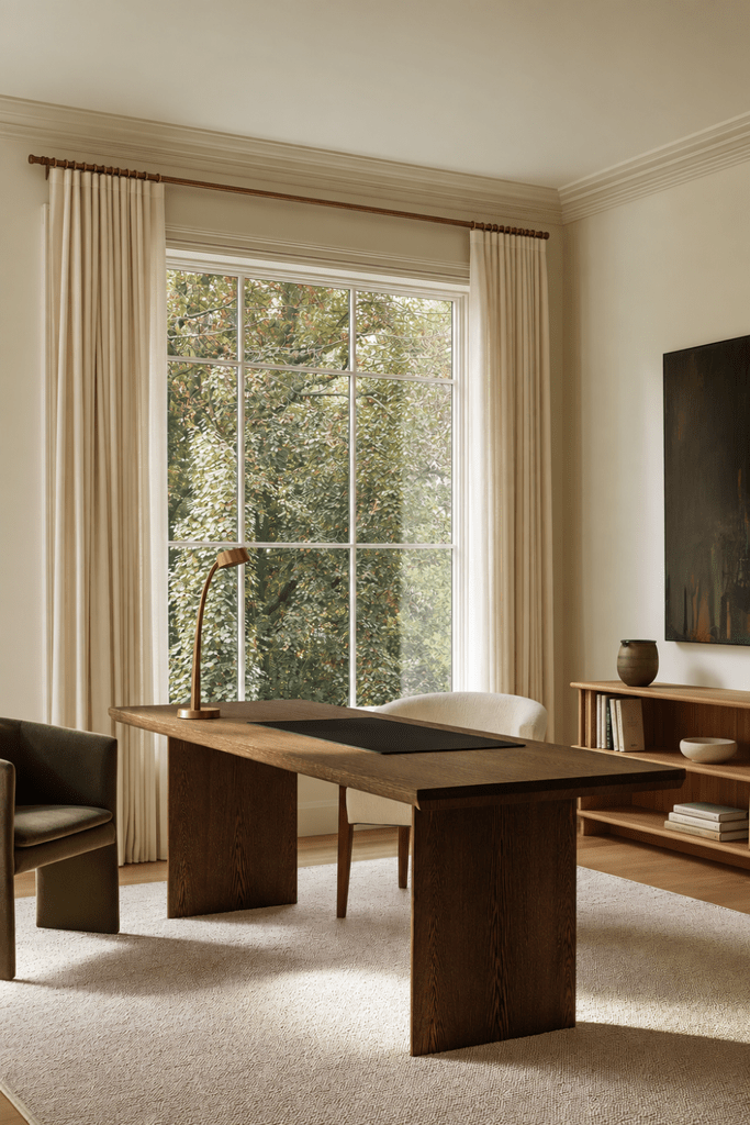
Soft Contrast That Still Feels Fresh
Olive green has just enough depth to make a room feel more cocooning, but it still keeps one foot in nature. Paired with warm ivory, it becomes one of those earthy fall colors that can shift the mood of a space without making it feel dark, heavy, or overly seasonal.
The reason this combination works so well is balance. Ivory gives olive room to breathe, while natural wood helps connect the two without introducing another dominant color. Matte finishes and tactile fabrics such as linen, wool, or boucle make the palette feel especially refined in Organic Modern interiors.
To keep this pairing soft and sophisticated:
- Let warm ivory lead through walls, upholstery, curtains, or larger furnishings.
- Use olive selectively in an accent chair, bedding, accent pillows, pottery, or artwork.
- Add natural wood as the bridge so the contrast feels grounded rather than stark.
- Choose muted olive tones instead of brighter or jewel-toned greens.
- Lean into tactile fabrics to give the deeper color a softer, more elevated presence.
The result feels quietly seasonal rather than decorated for fall. Olive adds depth, while ivory keeps the room light enough to feel calm and easy to live with.
Styling Note: If olive starts to feel too heavy, do not remove it right away. Give it more ivory around it first.
Rust + Mushroom
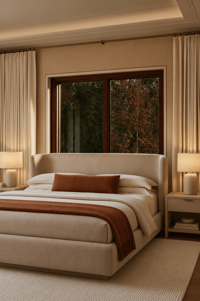
Warmth Without the Pumpkin Effect
Rust can bring an instant sense of warmth to a room, but it does not need to make the space feel overtly seasonal. Paired with mushroom, the color becomes softer and more sophisticated, almost like capturing the glow of late-afternoon autumn light without changing the personality of the room.
What makes this pairing work is temperature control. Mushroom has enough gray and taupe in it to quiet rust’s orange undertones, while cream or pale wood can keep the overall palette from becoming too warm. Textiles are especially useful here because linen, wool, and other tactile fabrics soften stronger color and make it feel easier to live with.
To keep rust feeling refined rather than overly autumnal:
- Let mushroom create the backdrop through walls, upholstery, rugs, or larger furnishings.
- Keep rust concentrated in one or two places instead of repeating it throughout the room.
- Introduce rust through textiles such as a lumbar pillow, throw blanket, or upholstered accent.
- Add cream or pale wood if the palette begins to feel too warm or visually heavy.
- Avoid surrounding rust with too many warm browns, which can push the room toward a more rustic look.
Think of the relationship simply: mushroom is the backdrop, rust is the moment. That small dose of warmth can shift the entire mood of a room while still feeling polished and restrained.
Styling Note: Treat rust like punctuation. A small amount can warm an entire room without turning the palette orange.
Ochre + Walnut
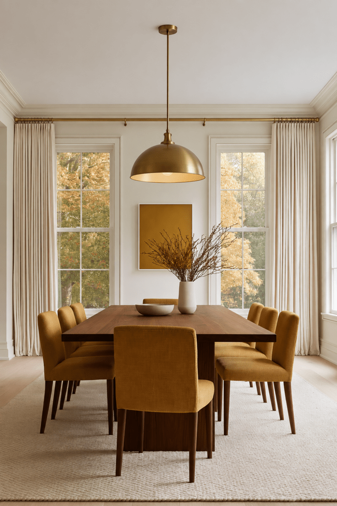
Golden Warmth With Depth
Ochre and walnut bring a richer, more grounded mood to a room, but they do not have to feel heavy. Among earthy fall colors, this pairing works especially well because ochre adds a soft golden lift while walnut brings depth through warm brown rather than stark black.
The key is proportion. Walnut feels most sophisticated when it appears in something substantial, such as a table, cabinet, or architectural detail, while ochre works beautifully as a smaller focal moment through upholstery, textiles, or art. Cream, oatmeal, linen, wool, and other matte finishes help soften the contrast and keep the palette relaxed.
To make ochre and walnut feel refined rather than rustic:
- Let walnut do the grounding through one larger furniture or architectural piece.
- Use ochre as the lift in a chair, accent pillow, artwork, or textile.
- Surround both with lighter neutrals such as cream, oatmeal, or soft ivory.
- Choose matte, tactile finishes instead of anything overly glossy or polished.
- Keep dark accents edited so the room feels intentional rather than weighed down.
Think of the balance this way: walnut grounds, ochre lifts, and cream gives both room to breathe. Together, they create the kind of golden depth that feels seasonal without looking decorated for the season.
Styling Note: When using two rich colors together, leave something light nearby. Contrast is what keeps richness from becoming heaviness.
Burgundy + Camel
A More Sophisticated Side of Fall
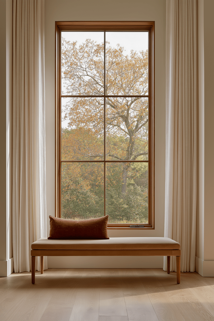
Burgundy brings a different kind of depth to autumn decorating. Instead of feeling earthy in the obvious sense, it can make a room feel more intimate, polished, and quietly dramatic. Paired with camel, that richness becomes warmer and easier to live with.
The key is choosing the right version of each color. Muted wine or oxblood feels more refined than bright red, while camel creates a warm neutral foundation that does not compete for attention. Cream, walnut, stone, or aged brass can then connect the pairing back to an Organic Modern interior without adding another saturated shade.
To keep burgundy and camel feeling elegant and balanced:
- Let camel create the foundation through leather, upholstery, wool, or linen.
- Use burgundy in smaller doses through an accent pillow, artwork, throw blanket, or one upholstered piece.
- Choose muted wine or oxblood tones rather than anything too bright or cherry red.
- Add cream for breathing room so the deeper color never overwhelms the space.
- Bring in walnut, stone, or aged brass to make the palette feel more layered and refined.
Think of the hierarchy as simple: camel grounds, burgundy adds drama, and cream keeps everything light enough to breathe. The result feels like autumn dressed up slightly, still warm and inviting, but with a little more sophistication.
Styling Note: The deeper the accent color, the less of it you usually need. One burgundy piece can carry more presence than several lighter accessories.
Chestnut Brown + Muted Sage
Earthy Without Feeling Rustic
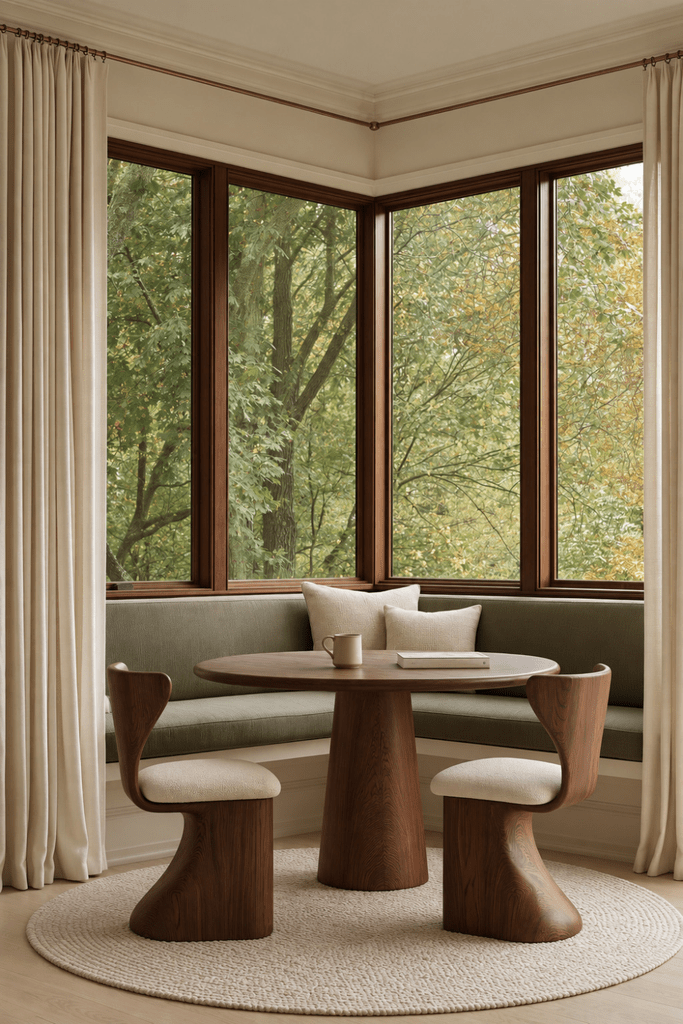
Chestnut brown and muted sage create one of the quietest earthy fall colors in the entire palette. Chestnut brings warmth and depth, while sage softens the look with a calm, natural contrast that feels connected to the season without leaning traditional or lodge-like.
The pairing works best when brown comes through substantial materials such as wood, leather, or woven pieces rather than themed accessories. Sage can then appear more selectively through upholstery, cabinetry, artwork, or textiles. Creamy walls and lighter fabrics keep everything open, especially when the view outside already carries similar tones.
To keep this pairing natural and refined:
- Use chestnut in larger materials such as wood furniture, leather, or woven accents.
- Introduce sage selectively through one upholstered piece, artwork, cabinetry, or soft textiles.
- Keep the background light with cream, ivory, or pale oatmeal.
- Let the outdoor view influence the palette when trees, branches, or muted greenery are visible.
- Choose softened tones rather than deep espresso brown or highly saturated green.
This combination feels especially beautiful when it echoes what is already happening outside. A brown branch, softened green leaf, pale sky, or changing tree can offer a more nuanced direction than obvious seasonal decorations ever could.
Styling Note: When borrowing color from nature, choose the muted version. Those slightly softened shades are often easier to live with long after the season changes.
Let Fall Deepen the Room, Not Take It Over
Bringing more color into your home for fall does not have to mean changing everything around it. The most refined spaces usually rely on balance, allowing one richer shade to add depth while lighter, quieter tones keep the room feeling open and familiar.
Earthy fall colors work best when they feel like an extension of what is already there. Start with the pairing that naturally complements your existing furniture, finishes, and textiles, then introduce it through something simple, like an accent pillow, artwork, throw blanket, or one substantial piece.
Fall does not have to arrive through pumpkins on every surface or an entirely new palette. Sometimes the season is felt most beautifully in one deeper shade, thoughtfully placed, that makes everything already in the room feel a little richer.
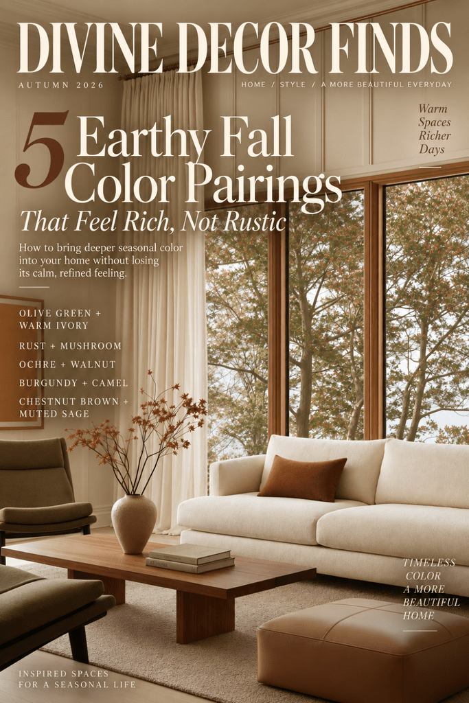
Save this post to Pinterest for the next time you want to bring deeper fall color into your home without losing the calm, refined feeling you love. 🤍
Explore more Discover Organic Modern inspiration on Divine Decor Finds for thoughtful ways to create a home that feels warm, layered, and beautifully connected to the season. 🌿

Leave a Reply