A Softer Direction for Color in 2026
There’s a noticeable shift happening in the way we think about color at home. After years of stark minimalism and fast-moving trends, many of us are craving spaces that feel calmer, warmer, and more emotionally grounding. That’s where neutral color palettes for 2026 come in. Rather than feeling cold or overly polished, these palettes are designed to support how we actually live.
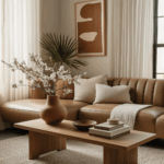
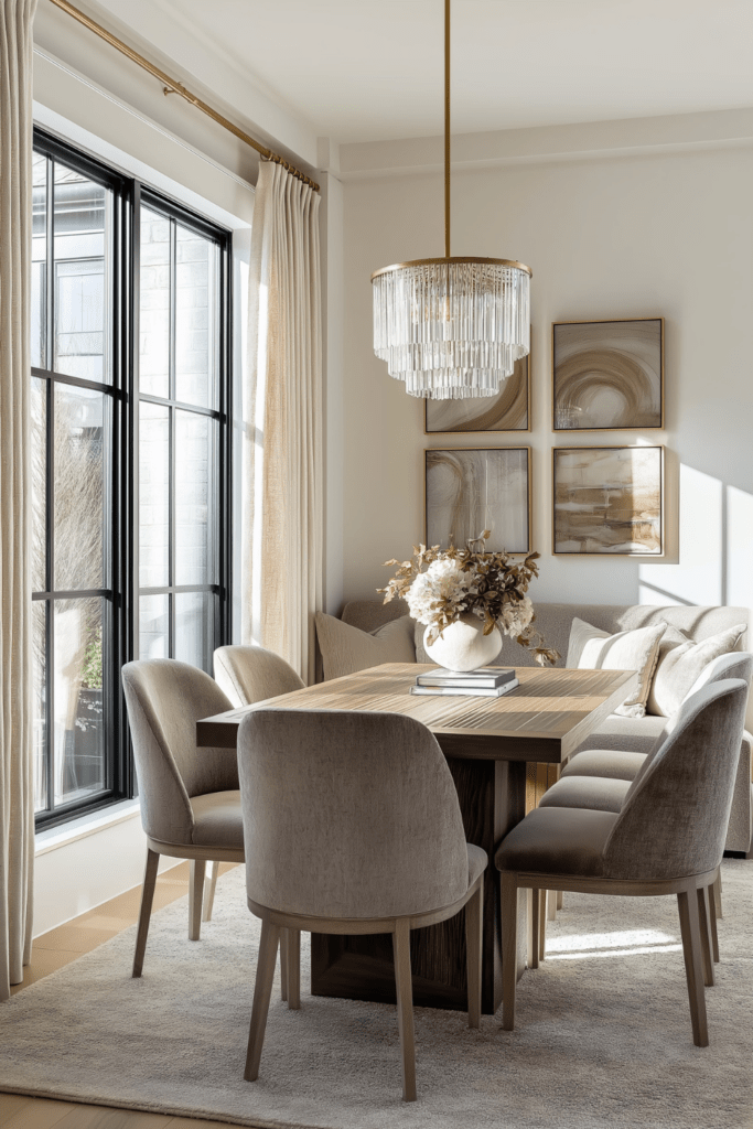
The emerging neutral color trends of 2026 lean into softness and warmth. Think creamy whites, gentle beiges, and muted earth tones that feel comforting instead of rigid. These warm neutral color palettes create a calm interior color palette that feels easy to live with, not just visually appealing for a moment in time.
This post isn’t about chasing the next big color moment. It’s meant to offer thoughtful guidance on choosing neutrals that feel livable, grounded, and timeless. You’ll see how Organic Modern influences are shaping color choices, why softer neutrals are replacing high-contrast schemes, and how these palettes are designed to age beautifully beyond a single season.
Why Neutrals Are Evolving in 2026
The way we choose color for our homes is deeply tied to how we’re feeling. As interior color trends for 2026 begin to take shape, a clear emotional shift is driving design decisions. After years of visual noise, bold contrasts, and fast-moving trends, many people are craving spaces that feel steady, calming, and supportive.
This shift is being shaped by a desire for homes that offer:
- Warmth that feels inviting rather than stark
- Softness that reduces visual tension
- A sense of stability and emotional grounding
Neutral interior colors are evolving to meet these needs. Instead of feeling flat or cold, today’s neutrals are layered and nuanced, creating spaces that feel calm the moment you step inside.
Homes are increasingly used as places to unwind, reset, and reconnect. When color choices support this intention, they help counteract overstimulation and mental fatigue.
In this way, neutral color palettes for 2026 feel less like a passing trend and more like a thoughtful response to how we want our homes to function. They provide visual rest, emotional balance, and a sense of quiet comfort that supports everyday life.
Warm Whites and Creams Replace Stark Bright White
One of the most noticeable shifts within neutral color palettes for 2026 is the move away from stark, bright white. While crisp whites once symbolized minimalism, they can often feel cold or uninviting in everyday living. In their place, softer alternatives are taking the lead.
These warmer whites show up as:
- Creamy whites with a subtle warmth
- Oat and bone tones that feel soft and grounded
- Ivory shades that reflect light gently
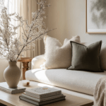
These soft neutral tones create a warmer, more welcoming atmosphere. Instead of sharp contrast, they offer visual ease, allowing spaces to feel calm and lived-in. This approach supports a warm minimalist color palette that feels clean without feeling stark.
Warm whites also serve as an anchor within neutral color palettes for 2026. They balance natural light, soften architectural lines, and pair effortlessly with wood, stone, and textured materials, creating spaces that feel timeless and cohesive.
Styling tip:
When choosing a warm white, test it in both natural and evening light. A shade that feels neutral during the day but slightly warm at night will create a more inviting atmosphere throughout the day.
Beige, Taupe, and Soft Brown Are the New Foundation
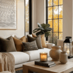
As color preferences continue to soften, earthier neutrals are becoming the quiet foundation of many homes. Beige, taupe, and soft brown tones are gaining popularity because they bring warmth and depth without overwhelming a space. This beige and taupe color palette feels natural, balanced, and easy to live with.
These tones work so well because they offer:
- Warmth without visual heaviness
- A grounded, calming presence
- A neutral backdrop that feels inviting rather than flat
Unlike cooler neutrals, beige and soft brown shades absorb light gently. They create spaces that feel settled and comfortable, making them ideal neutral home color ideas for everyday living.
These hues also align beautifully with Organic Modern interiors. Paired with natural materials like wood, stone, and linen, they enhance a space without competing for attention.
Styling tip:
Use beige and taupe tones on larger surfaces like walls, rugs, or upholstered furniture. This creates a warm foundation, allowing smaller accents and textures to layer in naturally without feeling busy.
Greige and Muted Gray Become Softer and Warmer
Cool gray once dominated modern interiors, but its sharpness is beginning to soften. In 2026, the shift is toward warmer interpretations that feel more balanced and inviting. This evolution is shaping a modern neutral color palette that prioritizes comfort alongside style.
This shift includes:
- Moving away from blue-based or icy gray tones
- Embracing warmer greige with beige or taupe undertones
- Using stone-inspired neutrals that feel natural and grounded
These softer shades create spaces that feel calm rather than stark. They offer visual balance, helping rooms feel cohesive and emotionally comfortable throughout the day.
Warmer grays also adapt beautifully to changing light. This flexibility allows them to function as timeless neutral colors that support both daytime brightness and evening coziness.
Styling tip:
Pair greige walls with warm wood finishes or soft textiles to enhance their warmth. Avoid pairing them with cool metals or stark white trim, which can pull the color back toward gray.
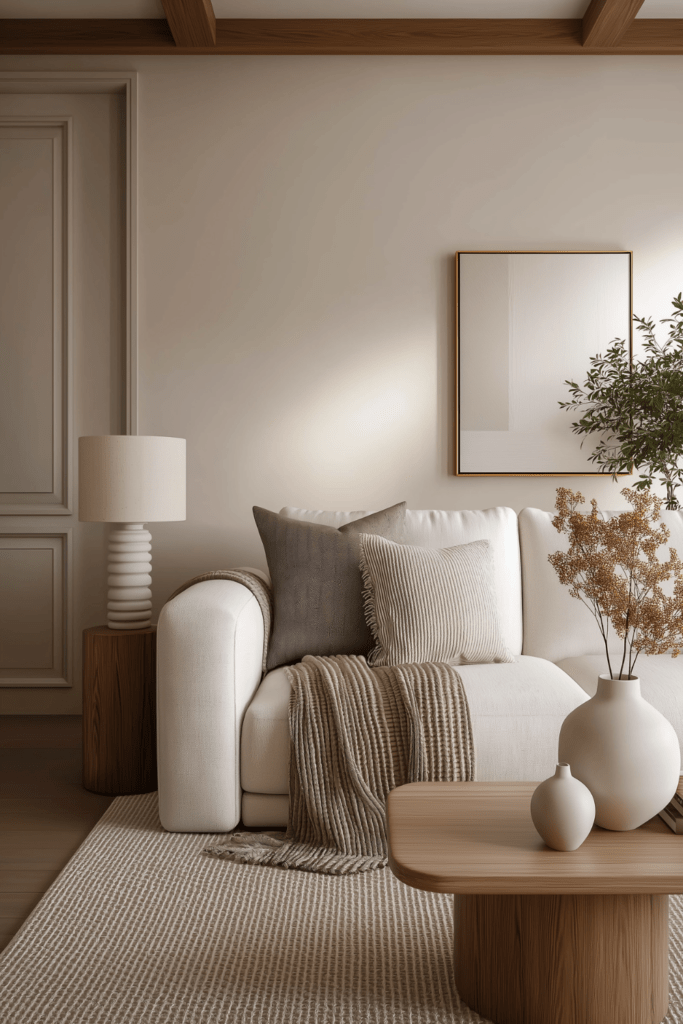
How to Layer Neutral Color Palettes Without Feeling Flat
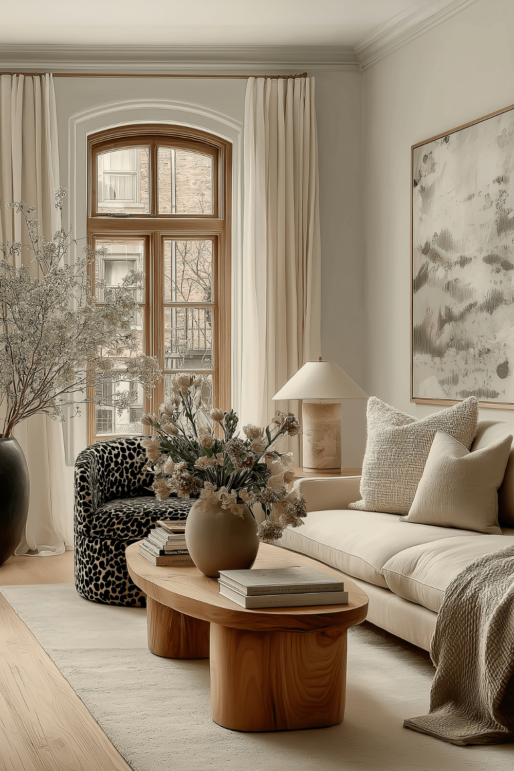
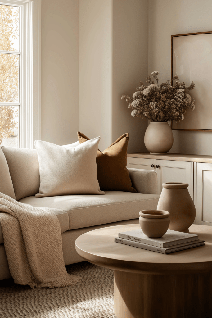
One of the most common concerns with neutrals is that a space might feel flat or one-dimensional. In reality, the most successful neutral color palettes for 2026 rely on thoughtful layering rather than high contrast. The goal isn’t drama, but quiet depth that feels warm and lived-in.
Effective neutral layering focuses on:
- Tone-on-tone color combinations rather than sharp contrast
- Mixing warm undertones to maintain visual harmony
- Using texture to create depth and softness
This approach allows a space to feel cohesive and grounded. When colors sit close together, the room naturally feels calmer and more intentional.
Undertones play a subtle but important role. Pairing neutrals that share warmth helps avoid visual tension and supports an organic modern color palette that feels balanced rather than busy.
Texture is what keeps a calm interior color palette from feeling flat. Natural materials like linen, wool, wood, stone, and ceramics introduce dimension through touch, shadow, and variation, adding richness without clutter.
Styling tip:
Layer neutrals in threes. For example, combine a light neutral base, a mid-tone neutral, and a deeper accent through textiles, decor, or furniture. This creates depth while keeping the palette soft and cohesive.
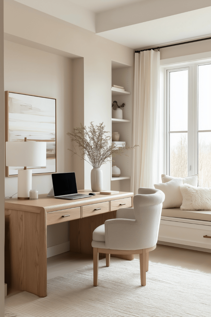
Where These Neutral Palettes Work Best at Home
One of the strengths of softer neutrals is their versatility. Neutral interior colors adapt easily to different rooms, creating spaces that feel cohesive without becoming repetitive. When chosen thoughtfully, these tones support both function and feeling throughout the home.
Some of the best places to use neutral home color ideas include:
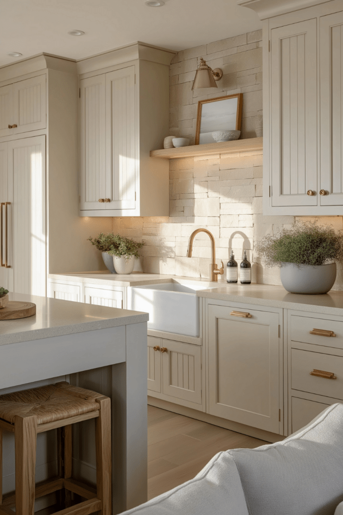
- Living rooms, where warmer neutrals create an inviting backdrop for gathering, relaxing, and everyday life
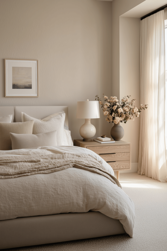
- Bedrooms, where soft, muted tones encourage rest and help the space feel calm and restorative
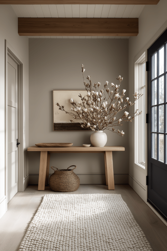
- Entryways, where gentle neutrals set a welcoming tone the moment you step inside
Each of these spaces benefits from softer neutrals in different ways. In shared areas like living rooms, they allow furniture and textures to layer naturally without visual overload. In bedrooms, they support relaxation and emotional comfort. In entryways, they create a smooth transition from the outside world into a calmer interior environment.
By using neutral palettes strategically, you create flow throughout your home. These colors work together quietly, making each space feel intentional, balanced, and easy to live with.
Choosing Neutrals That Will Last Beyond 2026
While trends can offer inspiration, the most satisfying homes are built on color choices that feel enduring. The goal of neutral color palettes for 2026 isn’t to follow a seasonal look, but to create a foundation that supports how you live year after year.
When selecting neutrals with longevity in mind, focus on colors that:
- Avoid strong or trend-specific undertones
- Feel balanced in both natural and evening light
- Adapt easily to different rooms and design styles
Timeless neutral colors are flexible by nature. They pair well with a wide range of materials, furnishings, and decor, allowing your home to evolve without needing constant updates. Warm neutral color palettes, in particular, offer softness and stability, making spaces feel comfortable in every season.
Choosing neutrals that last is ultimately about livability. When a color supports daily routines, emotional ease, and visual flow, it naturally feels relevant far beyond a single year.
Styling tip:
Before committing to a neutral shade, live with a large sample for a few days. Observe how it feels at different times of day and alongside your existing furniture. A color that feels consistently calm and adaptable is more likely to stand the test of time.
Neutrals That Support the Way We Live Now
As we look ahead, it’s clear that neutrals in 2026 are less about making a statement and more about creating spaces that feel good to live in. Warmth, calm, and presence are guiding today’s color choices, helping our homes become places of ease rather than stimulation.
Instead of chasing contrast or boldness, this new approach invites us to slow down and choose with intention. Thoughtful neutrals support daily life by feeling steady, adaptable, and quietly comforting.
As you think about your own space, consider these gentle reminders:
- Choose softness over sharp contrast
- Prioritize how a room feels, not just how it looks
- Trust subtlety to create depth, warmth, and longevity
Neutral palettes don’t need to be dramatic to be meaningful. When chosen with care, they create a foundation that supports rest, connection, and everyday living in a way that lasts.
If this post inspired you, save it to Pinterest for future color inspiration. Try one small warm neutral update at home this week, whether it’s paint, textiles, or decor. And if you’re craving more calm, intentional inspiration, explore more Organic Modern and slow living posts here on Divine Decor Finds 🤍